Spot what needs attention, faster: a Subgrade refresh
If you've logged in this week, Subgrade looks a bit different. We've rolled out a refresh focused on one thing: helping you see what needs your attention without hunting for it.
Nothing about how the app works has changed. Every page is in the same spot. Every action does the same thing. This is about getting out of your way so you can run the day.
Spot the urgent stuff at a glance
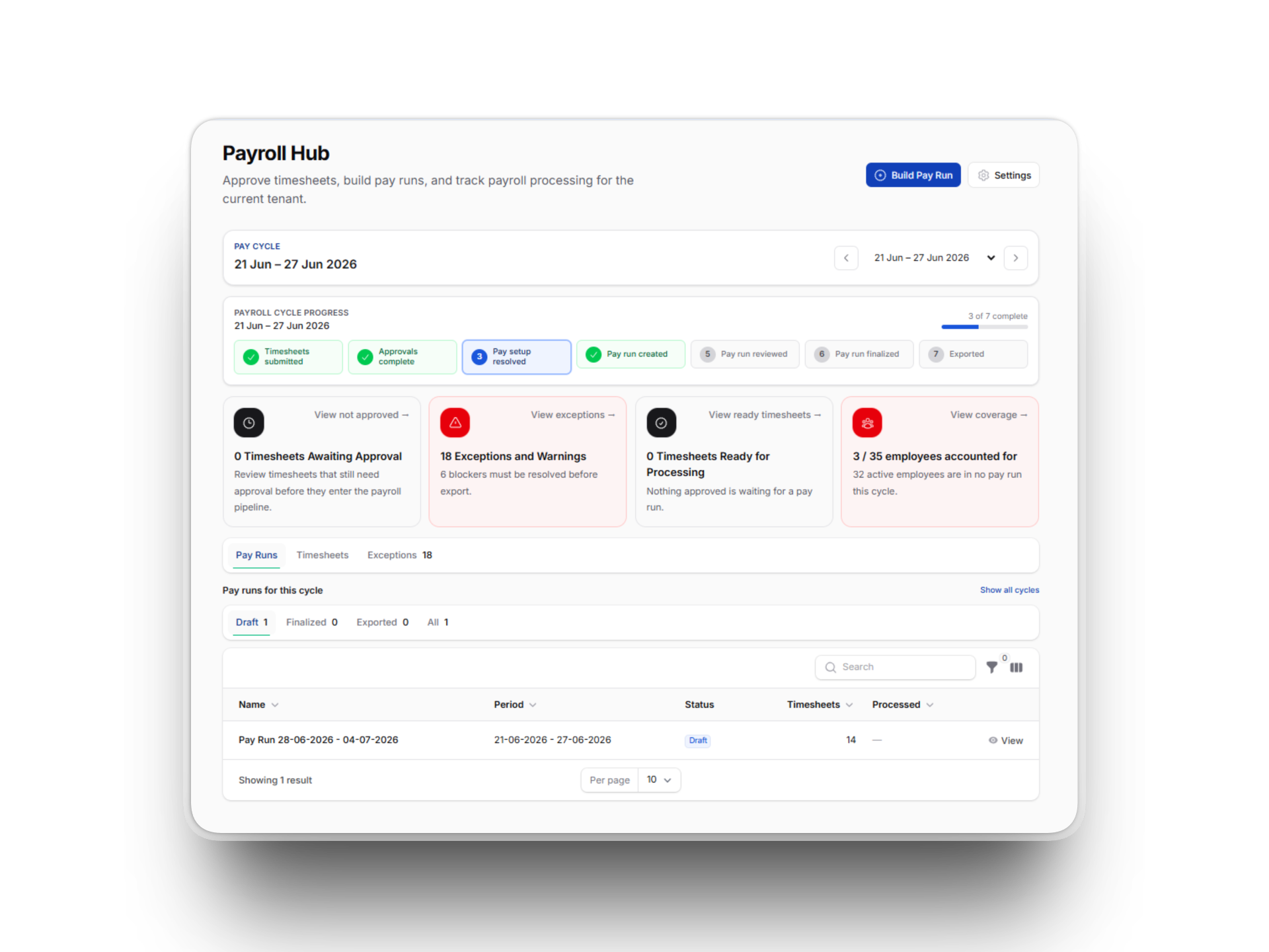
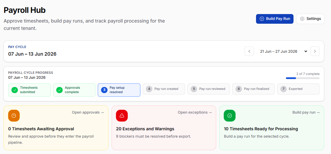
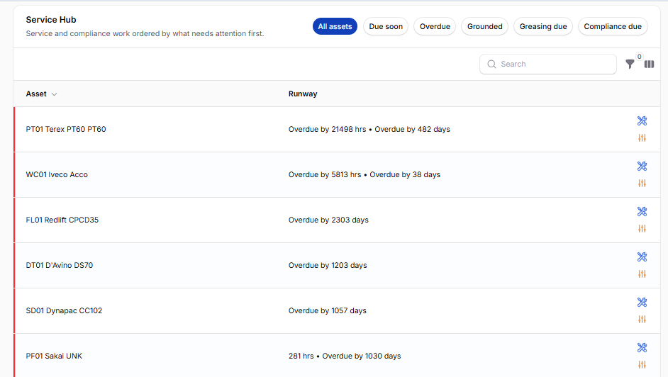
Open the Service Hub, the Pending Leave widget, or the Expiring Competencies list. You'll notice a coloured bar on the left edge of rows that need action — red for overdue or critical, amber for due soon or pending decision. Scroll a list of twenty machines and your eye lands on the two that are overdue without reading a single badge.
The same colour-coding flows through the new stat cards on the Payroll Hub and Budget Overview. Need to see how many timesheets still need approval? It's the warning-coloured card with the clock icon. Approved and ready to process? The green one. No more squinting at small numbers buried in chrome.
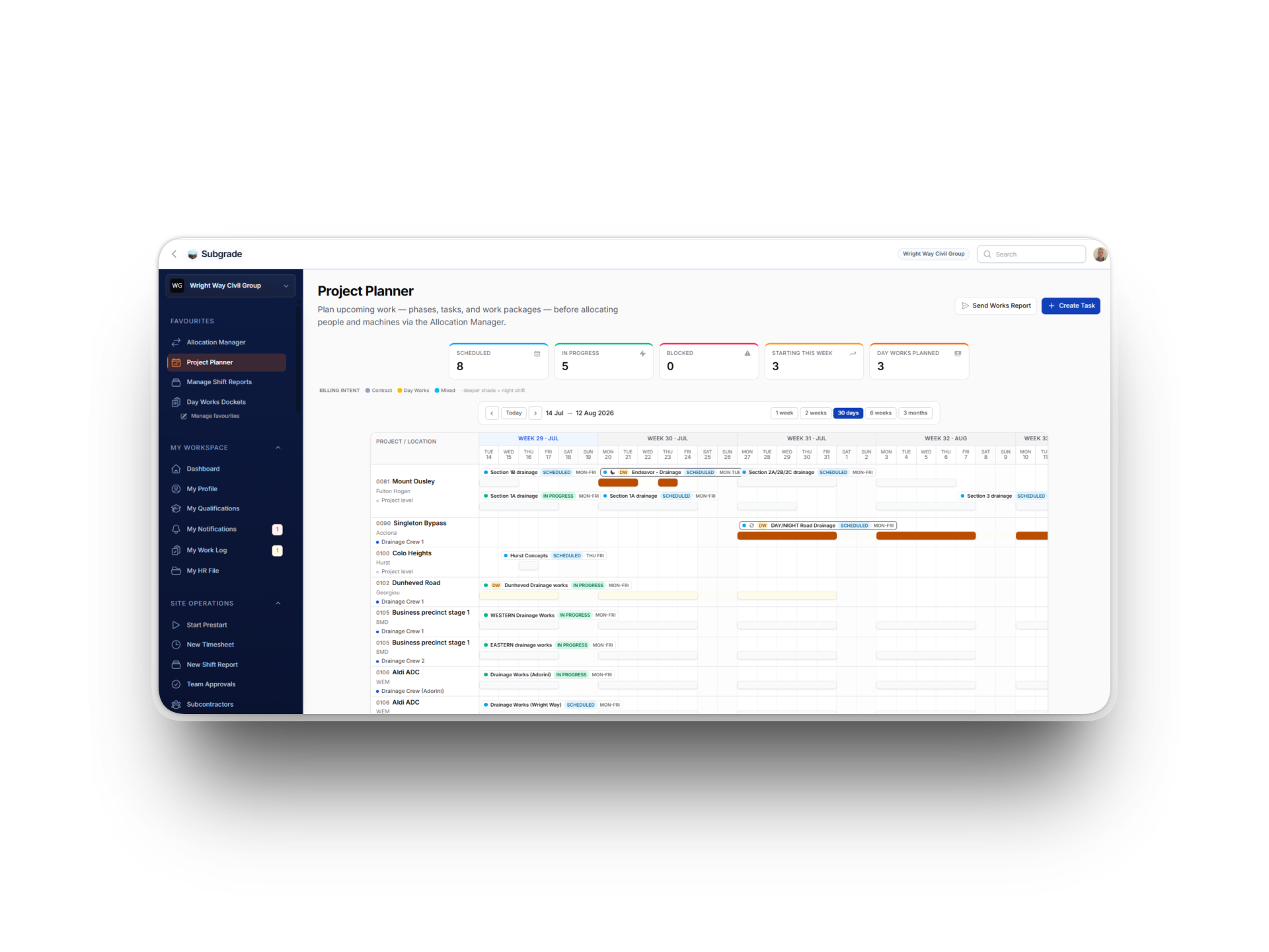
One click to your daily workflow
The Payroll Hub now opens with three big shortcut cards across the top — Team Approvals, Pay Runs, Timesheets. Whatever stage of payroll you're in, your next step is one click away rather than three menu jumps.
Quick Actions on the main dashboard got the same treatment, with polished cards for starting a prestart, capturing a timesheet, opening your work log, or checking your tickets and competencies.
Each part of Subgrade has its own quiet identity
You'll start to notice each area of the app has a subtle accent colour on its tabs:
Safety & Compliance (SWMS, Risk Assessments) — amber
Fleet & Assets (Allocation Manager) — teal
Finance & Budget (Payroll Hub, Budget Overview) — green
Project Management (Report Builder) — brand blue
More than anything else, this is what makes the app feel less like one giant menu and more like a set of distinct tools that happen to share a sidebar.
Reports actually print now
If you've ever tried to print a shift report or a timesheet straight from the browser, you'll know what came out: the sidebar, the top bar, a bunch of action buttons, and somewhere in the middle, the actual content. We fixed that. Hit print on any page and you get just the content, on white paper, with sensible margins.
Mobile and tablet layouts that breathe
On a tablet — or a phone in landscape — KPI strips and stat cards now lay out in a sensible two-column grid instead of stacking awkwardly. If you live in Subgrade on a phone in the cab, you'll notice less scrolling on the pages you check most.
Numbers update without the jolt
Change the date filter on Budget Overview, or switch tabs on Payroll Hub. Notice how the figures softly pop into place rather than blinking? Click a refresh button and notice it tells you it's working rather than leaving you wondering whether the click registered? Small things, but they add up to "this app feels alive."
Empty states that point you somewhere
When a section has nothing in it yet, you used to see a single grey line of text. Now you get a centred icon and a short hint about what unlocks the data. "Approved timesheets will appear here once posted to the budget ledger." Less dead-ends, more nudges forward.
The Budget Issues card has flipped its empty state too — instead of a sad grey "no issues detected", it now reads as a positive All clear confirmation, because no issues is good news.
Dark mode is properly dark
For folks running Subgrade in dark mode: the page, cards, and modals now sit at three distinct elevation levels. Cards visibly float above the page; modals pop above cards. Previously they all blended into one shade of slate. Easier on the eyes, especially on long days reviewing rosters.
What's next
With the visual foundation in a healthy place, the next round of changes will be driven by what you tell us is awkward or slow — not what we think looks nice. If something in the new design isn't working — too dense, too sparse, an empty state that misses the point — we genuinely want to know.
Drop us a note via the in-app feedback link, or reach out directly.
Cheers, and enjoy the new look.